|
|
Format Display - Label Item Format Dialog Configuring the appearance of overlay label items. |
|
|
This topic relates to deprecated functionality. Design window functions are now superseded by those found in 3D windows. |
Label Item Format
To access this dialog:
-
In the Format Display dialog, select the Labels tab (not available for all data types). If labels are not already available as buttons, click Reset... to select a data column from the Reset Labels dialog. Click OK and, back in the Labels tab, click the Style sub-tab (if not already selected) and click one of the new buttons.

This dialog is displayed as part of the label definition process when adding annotation to an overlay using the Format Display dialog. To access this dialog, you will need to have:
-
Selected an overlay from the Overlay Objects list (Overlays tab).
-
Selected to display the overlay as Labels Only (Overlays tab).
-
Selected the Labels tab.
-
Added labels using the Reset... button.
-
Clicked the Style sub-tab and clicked a button representing one of the label items specified.
Commands are split into three categories:
Each group of commands is found on a dedicated tab at the top of the screen, and contain the following fields:
Show Text: toggle the display of label text. You can use this option, for example, to hide individual items of label information.
Style: select a text style (or styles) from [Bold], [Italic], [Underline] and [Word Wrap].
Number Format: applies to the display of numeric values. There are three options:
-
Integer: select this option to enabled the drop-down list displaying further options: Round Up will round the number value for the label item up to the nearest whole number. Nearest will find the nearest whole integer and Round Down will round the label value down to the nearest whole integer.
-
General: values will be displayed as they are found in the corresponding table, with no rounding applied.
-
Decimal Places: to specify the number of relevant decimal places that a numeric value will honour, select this option and use the spin buttons to select a number of places.
Font Size: clear the Defaults check box to specify the size of the displayed font (in points).
Color: label items can be colored individually, either by specifying a colour, or a legend from which colour values will be derived. The following options are available:
-
Fixed Color: display the label text using a single fixed color.
-
Color Using Legend: vary the text color according to a field value or attribute. For more information on setting up legends, see Related Topics. If this option is enabled, you can select from the following options:
-
-
Column: vary the text color by a field value or attribute.
-
Legend: select a legend. To apply the selected legend to the currently selected Column, click Apply.
-
Use default alignment: toggle the use of default text alignment. Clearing this check box enables the following options:
Horizontal: specify a relative alignment (left, right or centre) for the label item text.
Vertical: as above, but choose a vertical alignment from top, middle or bottom.
Borders: select a border style from the following options:
-
No Border: show a borderless label item.
-
Fixed Color: select this option, and color from the drop-down list to show borders in a single color.
-
Same Color as Text: selecting this option will display the border in the same color as the label text.
-
Use Fill Legend Linestyle: select this option to use the current object's fill legend (see below) when drawing a border.
Fill: this option is used to create a background colour for your label item. You can either specify a static colour, to be used for all instances of the label item (i.e. the same field on all labels), or you can color each instance of a label item based on the contents of a column. This would normally be the same column as used to dictate the value of the label (as specified on the Contents sub-tab of the Labels tab), but you can select any field associated with the current object's table. Selecting this option enables the following options:
-
Fixed Color: specify the fill color using a single fixed color.
-
Color Using Legend: vary the fill color according to a field value or attribute. For more information on setting up legends, see Related Topics. If this option is enabled, you can select from the following options:
-
-
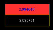
Column: vary the fill color by a field value or attribute. The following image shows an AU label field coloured with the legend associated with the grade value. The second field has a static text and border color and no fill:

-
Legend: select a legend. To apply the selected legend to the currently selected Column, click Apply.
-
|
|
Related Topics |
|
|
The
Format Display dialog Formatting Object Overlays The Overlays tab |

